What I'll attempt to do is take these concepts of embodied cognition and the tie between the physical and psychological that Micheal reviewed while applying them to software product design.
What is Embodied Cognition?
First, though, is we need to establish what Embodied Cognition is. Basically it describes how the physical inputs from your body have a direct, sub conscious affect on how you perceive the things and people around you. Some examples that Michael reviewed were :
- Warmth conveys affection, safety.
- Weight implies quality or seriousness.
- Cold can mean distant, unfriendly.
 |
| Mmmmm! |
Some recent research suggests some ways these can alter our perception. Put a bunch of strangers together in a room with hot coffee and they'll perceive people as friendly. Replace the coffee with ice water and a less friendly impression will linger. Give students heavy clipboards and they'll take an experiment much more serious than if they had small flimsy pads of paper.
In practice, this has manifested itself in various ways. BMW tightened the hinges on their car doors, giving them a heavier feel and imparting a sense of quality or safety. Apple stores use high tables, forcing you to lean forward helping to emphasize progress and momentum. Converse stores have scuffed, slightly worn floors, drawing a parallel to the comfort of a well-worn pair of Chuck Taylors.
Those are all well and good, right? So how can you take these physical examples and apply them to software? The obvious pieces are going to be visual parallels that you are likely already aware of, but may not exactly understand why they're better.
Look at these two apples :
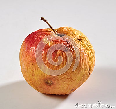
Which is more appealing? Pretty easy, right? The fresh, plump, clean line apple is much more appetizing, right? The wrinkly older apple is not very inviting. So translate these same visual elements to an interface.
You would want :
- Clean lines (plump)
- Less clutter (wrinkles)
- Inviting colors. (red, green)
The idea is not to make the page look like an apple. It is about identifying what are the things about a fresh apple that make it have the psychological connotation that it has.
What makes it physically inviting?
This would be a great start for a page explaining why to purchase a product or asking people to join a service.
What makes it physically inviting?
This would be a great start for a page explaining why to purchase a product or asking people to join a service.
Practical Application
This was one of those talks that made feel a little silly. Not because it was incredibly eye-opening, but because this helps explain some fairly obvious trends in design. I felt silly because I never really connected the deeper understanding of why we find physical metaphors functional in design. Still, with that realization, there is the practical application of the concept. Which is made a bit more difficult when you're talking about software.
We can't tighten some bolts to make our software heavier. But we can include sounds that impart that same feeling. We can't make our software warmer, but we can use colors and spacing to provide a sense of freshness and welcoming. Before you can do that, though, you have to decide on what sense you want your software's interface to convey.
Is it warm and inviting? Serious and strong? Light and casual? A method to discover this could be to go to various locations that you get this sense from and consider your software with that theme. So if I'm building a new dealership management software suite, I might go to an office lobby to find the elements that convey "serious business".
 |
| Some serious business happening in this lobby. |
Final Thoughts
As the subtleties of this point of view began to sink in, I became reflective on my sites. They are information dense while having banner ads on virtually every page. They are more like the wrinkly rotten apple than the fresh inviting apple. The challenge is to reconcile the two. How do I present the data that our user's demand but still recall inviting elements to make sure they come back? Never mind adding the business case to augment existing revenue with additional advertising.
This is why consultants that are really good with UI and UX are paid well. Anyone can tell you the clean design just feels better to use, not everyone can articulate why they feel better and how to apply it to a new product.
I became most excited about this conversation when I began applying last year's concepts of No UI. Finding the right visual cues can help keep our interfaces trim and easily digestible. My goal moving forward with our larger design projects will be finding the right physical metaphors to combine with minimalist interfaces. There's a good recipe taking form here, particularly as our automated systems continue to improve!